Bar graphs
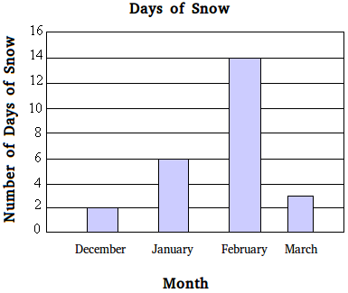
Bar graphs, also called bar charts, compare values between categorical data over a period of time by using rectangular bars. Bar charts might be little easier to create than some other types of graphs that might take a long time to construct. The figure below shows a bar graph.

The information displayed in the bar graph above is straightforward. It tells how many days of snow there were during the month of December, January, February, and March.
For example, in December there were two days of snow and in February there were fourteen days of snow.
If the bar does not extend to the next line on the scale, just approximate the value.
For the month of March, the bar does not extend all the way to four. However, a close look shows that the bar is between 4 and 2. Therefore, a good approximation is 3, or 3 days of snow in March.
Parts of a bar graph
A bar graph has the following 5 parts
- Title
- Categories
- Scale
- Labels
- Rectangular bars
The title tells what the bar graph is about. For example, the title of the bar graph above is "Days of Snow"
The categories show the categorical data that you are trying to compare. For example, December, January, February, and March are the different categories you are trying to compare. Each category, such as January, is a categorical variable. Categories are usually displayed on the x-axis.
The scale shows the amounts for the categories and the interval that is used to compare the categories. The scale is usually displayed on the y-axis.
There are two different labels on a bar graph, one for the categories and another one for the scale. The one for the categories tells you what the categories are about and the one for the scale shows what is being counted. For example, the label used for the categories is "Month" and the label used for the scale is "Number of Days of Snow"
Finally, we use rectangular bars of equal width to show frequencies. The height of the rectangular bar represents the frequency of each category.
Types of bar graphs
Here are the 4 different types of bar graphs:
- Vertical bar graph
- Horizontal bar graph
- Grouped bar graph (also called multiple bar chart or clustered bar chart)
- Stacked bar graph
The vertical bar graph is the most common type of bar graph. It is the one that you see in the figure above.
Horizontal bar graphs
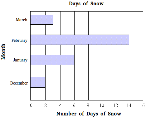
The bars do not have to be vertical. Information can be displayed as well with horizontal bar graphs as shown below. In a horizontal bar graph, the different categories are displayed on the y-axis while the scale is displayed on the x-axis.

Grouped bar graphs
When each category can have more than one value, you could use a grouped bar graph to display the data. The grouped bar graph below shows the math scores for 4 students in the 8th grade. Notice that a grouped bar graph includes a key at the bottom of the graph and different colors to represent the different values in each category.
For example, the red bar graph is the score on the final exam. Eric got a 60 on the final exam.

Stacked bar graph
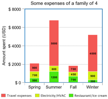
The stacked bar graph is similar to the grouped bar graph since each category can also have more than one value. However, with a stacked bar graph, just like the name implies, the values are stacked on top of each other.
In the graph below, the category called "Summer" has 3 values stacked on top of each and the amount of money the family spent during the summer on Restaurant/Ice cream is 1200 dollars.

How to read information on bar graphs
Example:
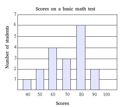
Use the bar graph below to answer the following questions:

- What is the scale of the bar graph?
- What is the title of the graph?
- How many student scored 80?
- How many students got 60 on the test?
- How many students took the test?
- Why is there no bar above 100?
- If the passing grade is 70, how many students passed?
Answers
a. The scale is on the left of the graph and the scale goes from 1 to 7 with an interval of 1.
b. The title is "score on a basic math test"
c. 6 students score 80
d. 4 students got 60
e. 1 student got 40, 2 students got 50, 4 students got 60, 3 students got 70, 6 students got 80, and 2 students got 90
1 + 2 + 4 + 3 + 6 + 2 = 18
So, 18 students took the test.
f. There is no bar above 100 because no one got 100 on the test.
g.
3 students got 70, 6 students got 80, and 2 students got 90
3 + 6 + 2 = 11. So 11 students passed the test.