Display of qualitative data
Two types of graphs that can be used for the display of qualitative data are the bar graph and the pie chart. A bar graph is also called a bar chart.
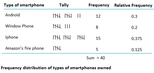
We will make a bar graph and a pie chart using the frequency distribution and the relative frequency distribution of type of smartphone.
To make a bar graph, use the frequency distribution. To make a pie graph, use the relative frequency distribution.
Display of qualitative data using a bar graph

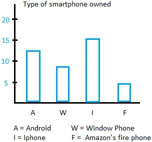
How to make bar graph.
- Use a coordinate system.
- Put the type of smartphone on the horizontal axis and the frequency on the vertical axis.
- Draw one bar for each category. The bar is just a shape looking like a rectangle.
- The height of the bar is the frequency of the category.

Notice that the distance between the bars is the same. Furthermore, the width of the bars is the same.
Display of qualitative data using a pie graph
How to make a pie graph
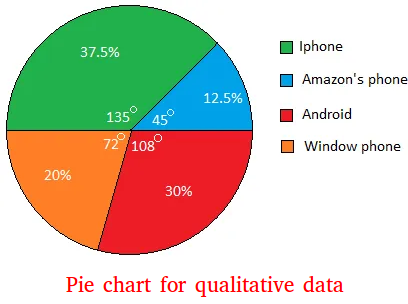
A pie graph looks like a circle. A circle has 360 degrees.
The entire pie represents either the entire sample or the population.
The number of parts is the same as the number of categories. Since we have 4 categories, the circle will have four parts.
Each part will have an angle measure. Adding the angle measures of the 4 parts will equal to 360 degrees.
To find out how big a part will be, just multiply the relative frequency of a category by 360 degrees.
For example, the relative frequency of Window phone is 0.2
0.2 × 360 degrees = 72 degrees
Window phone will occupy 72 degrees in the circle.
For Android, 0.3 × 360 degrees = 108 degrees
For Iphone, 0.375 × 360 degrees = 135 degrees.
For Amazon's fire phone, 0.125 × 360 degrees = 45 degrees
Notice that 72 + 108 + 135 + 45 = 360

Percentage
0.3 = 30%
0.2 = 20%
0.375 = 37.5%
0.125 = 12.5%